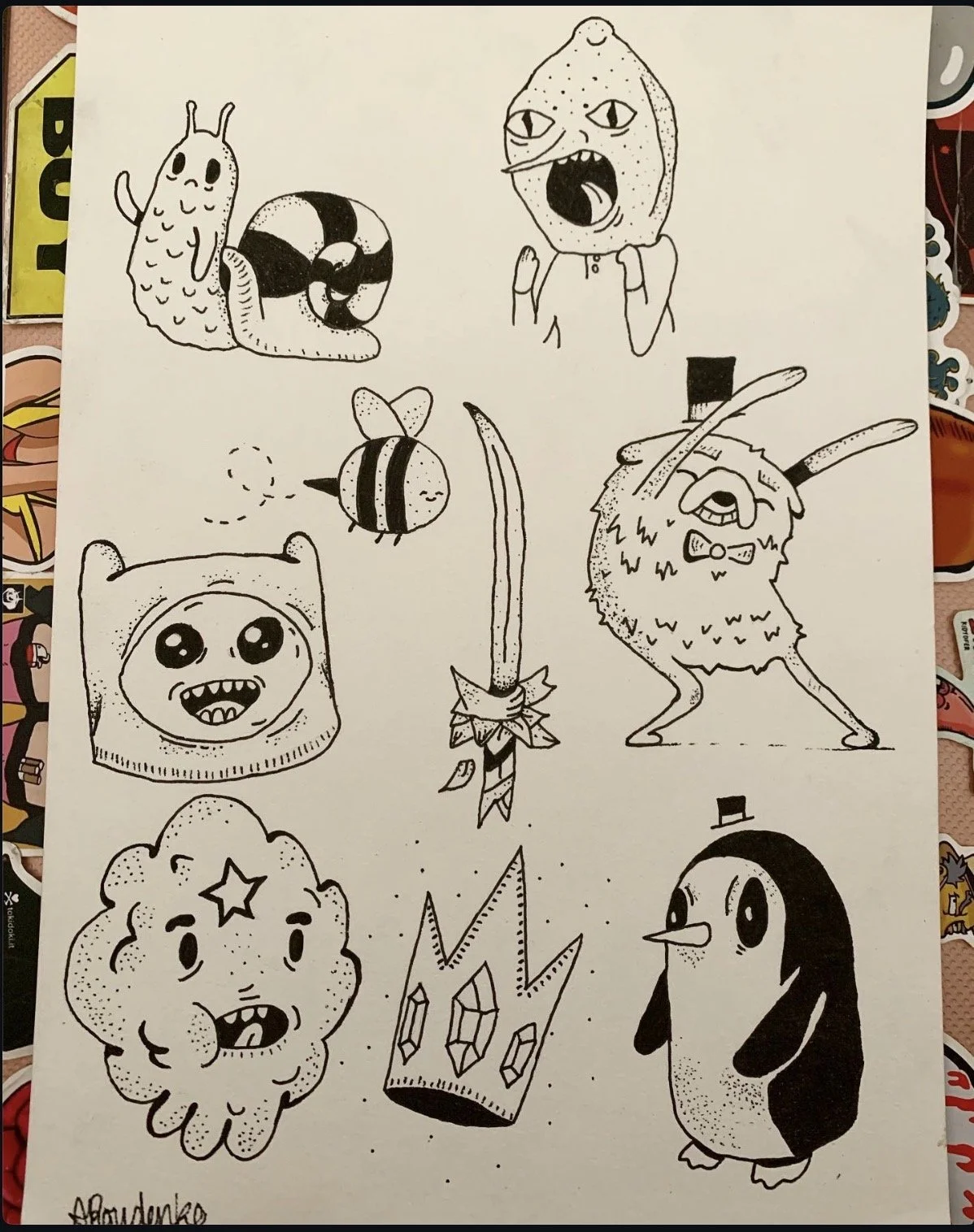
Adventure Time
Fresh out of my TAFE course in late 2019, I started seriously looking into the tattoo industry. To build up a competitive portfolio, I dove headfirst into creating traditional flash sheets. For this layout, I wanted to take the soft, playful aesthetics of Adventure Time and anchor them down with crisp outlines and heavy stippling texture.
Mapping out classic characters like Finn, Jake, Gunter, and Lumpy Space Princess allowed me to balance clean animation lines with gritty, hand-stippled values.
Hand-inked using varying fine-liner weights. I focused heavily on stippling gradients to emphasize character shapes, like the puffy contours of LSP or the dense black ink fill on Gunter's coat.
This sheet represents a pivotal shift from standalone fine art pieces to functional, commercial tattoo flash concepts. It was an incredible exercise in spatial layout, figuring out how to balance multiple independent character icons on a single page so they look cohesive.